Home
The one full-bleed atmospheric moment (hero) sits on Home; the rest of the site holds the wide-margin Marginalia spine. Section 04 "Victors, not victims." is a rotating-portrait module.

How it Works
Device explainer, split-view learning, getting-started steps, and a real FAQ accordion (first row expanded). Tablet folds the three-column blocks to two.

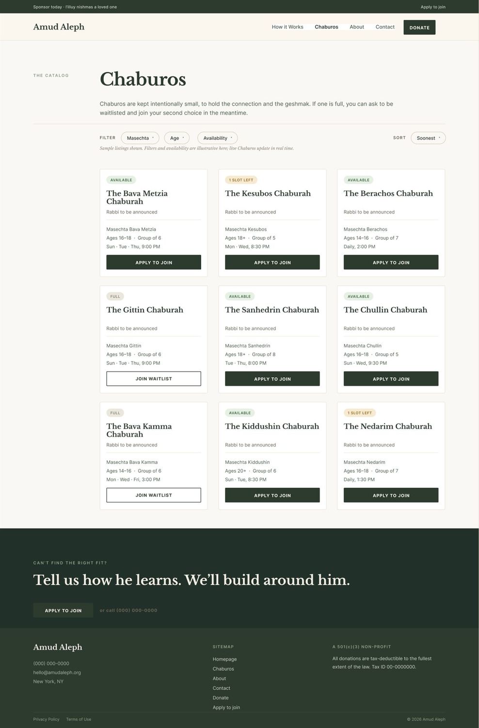
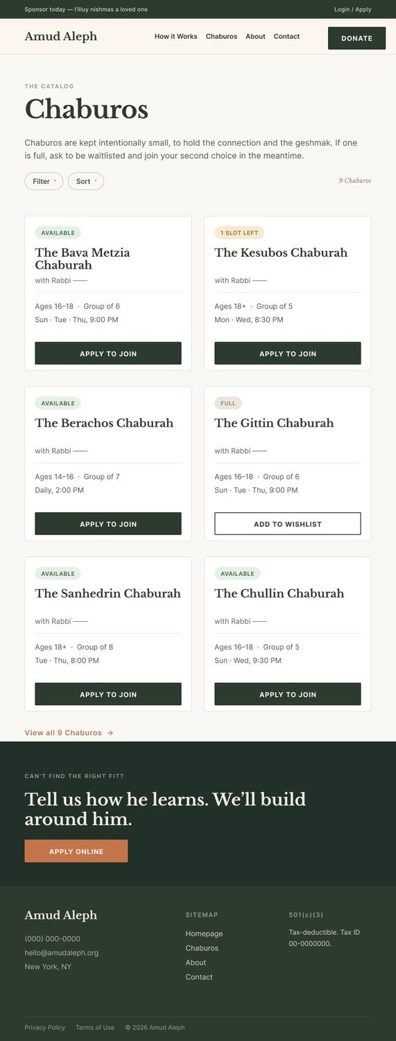
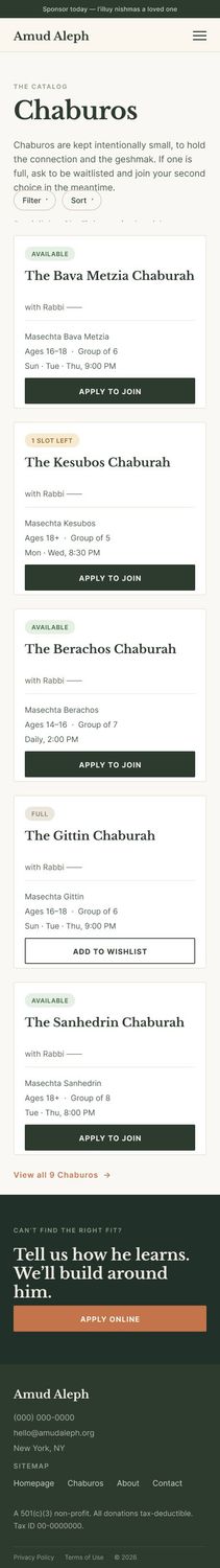
Chaburos
The catalog. Card states shown across the grid: Available, 1 Slot Left, and Full (Add to Wishlist). Sample listings; live data is gated. Desktop 3-col → tablet 2-col → mobile 1-col with "view all".
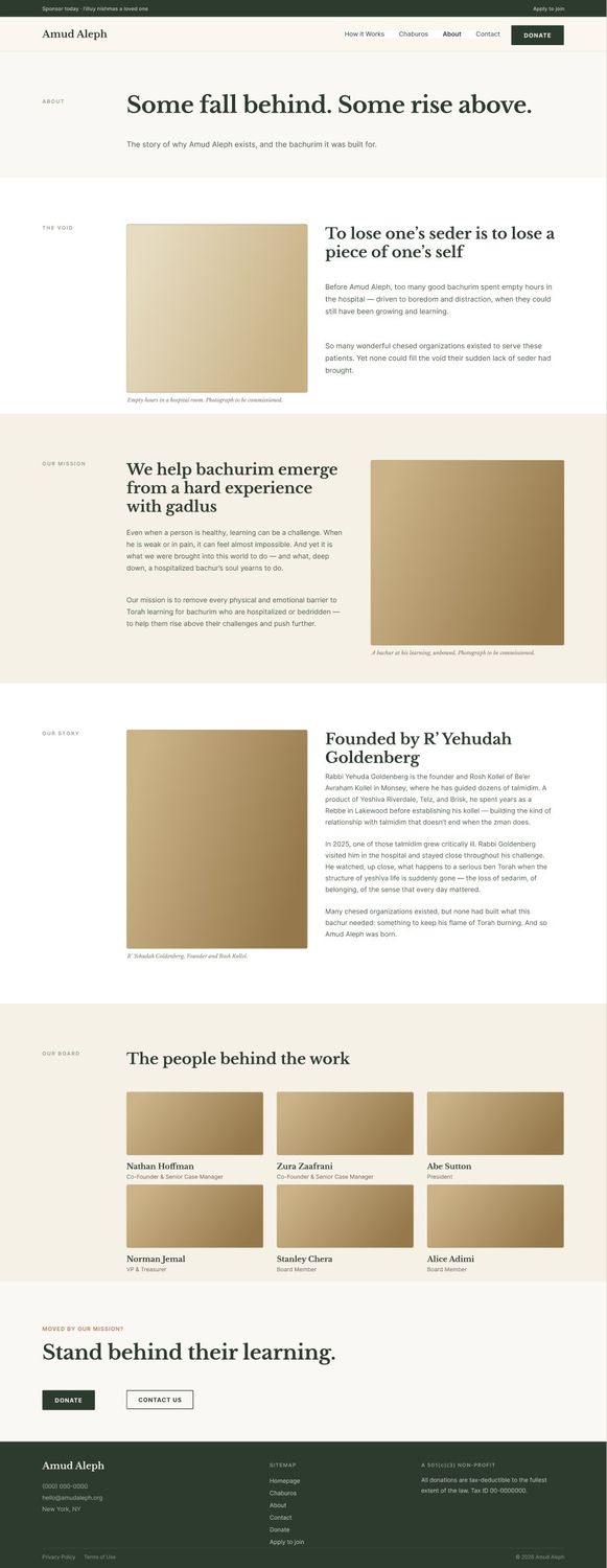
About
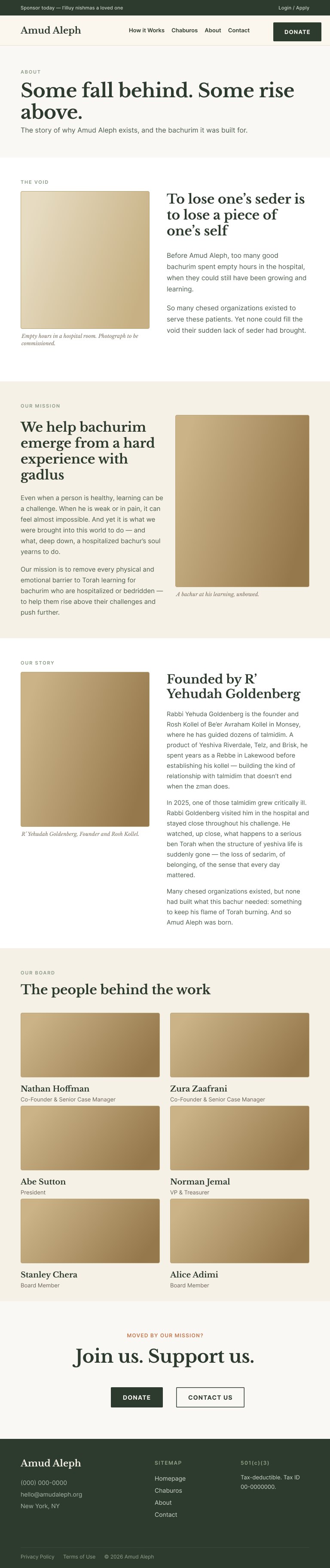
The void, the mission, the founder story, and the board. Board grid folds 3-col → 2-col on tablet and mobile. Copy is identical across all three viewports.

Contact
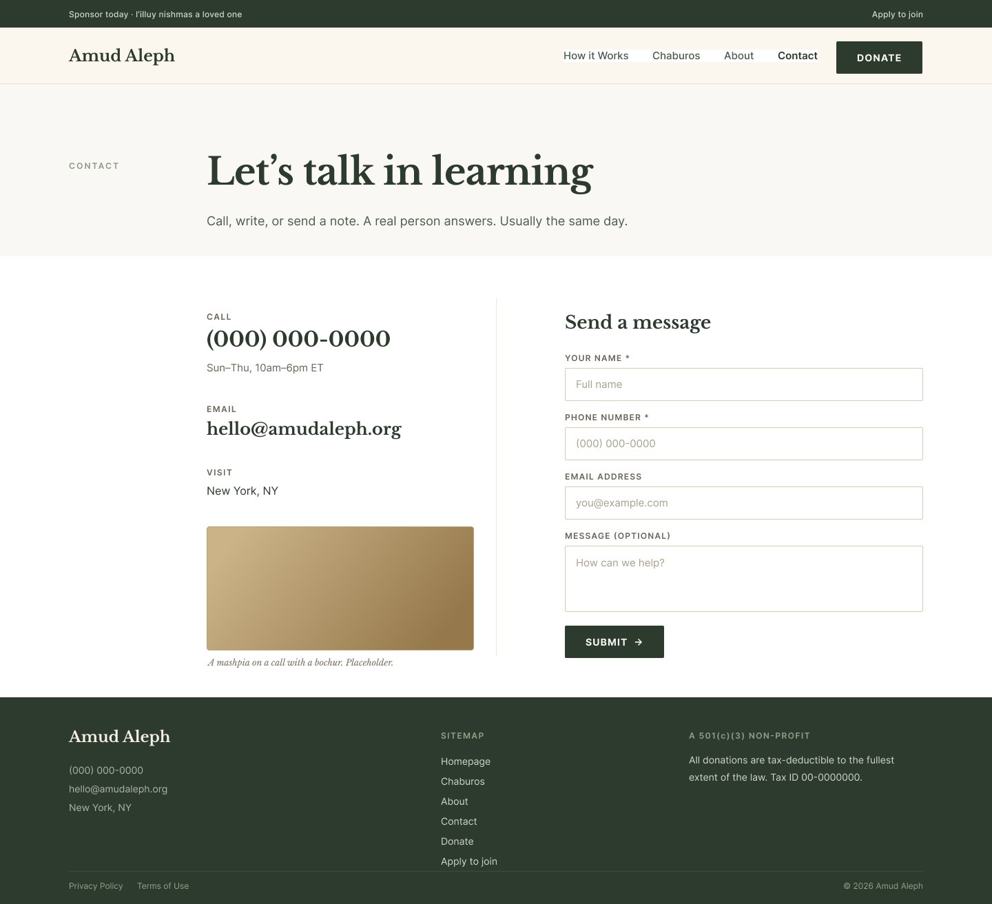
Contact details plus the "Send a message" form. The form's default state is here; focus / filled / error / success live on the component board.
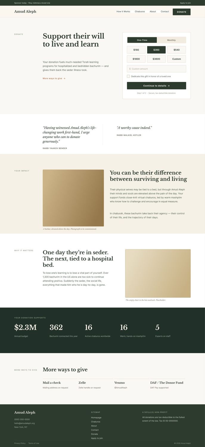
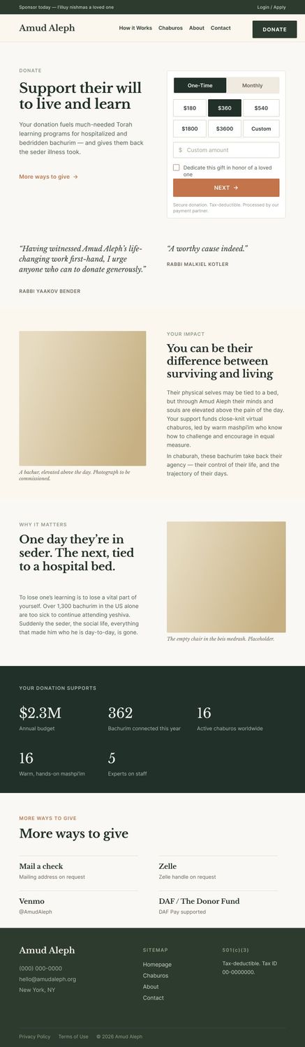
Donation
Full donation widget (one-time / monthly, tiered amounts, dedicate, secure note), testimonials, impact, and the support stats. The 5-across stats band folds to a grid on tablet.

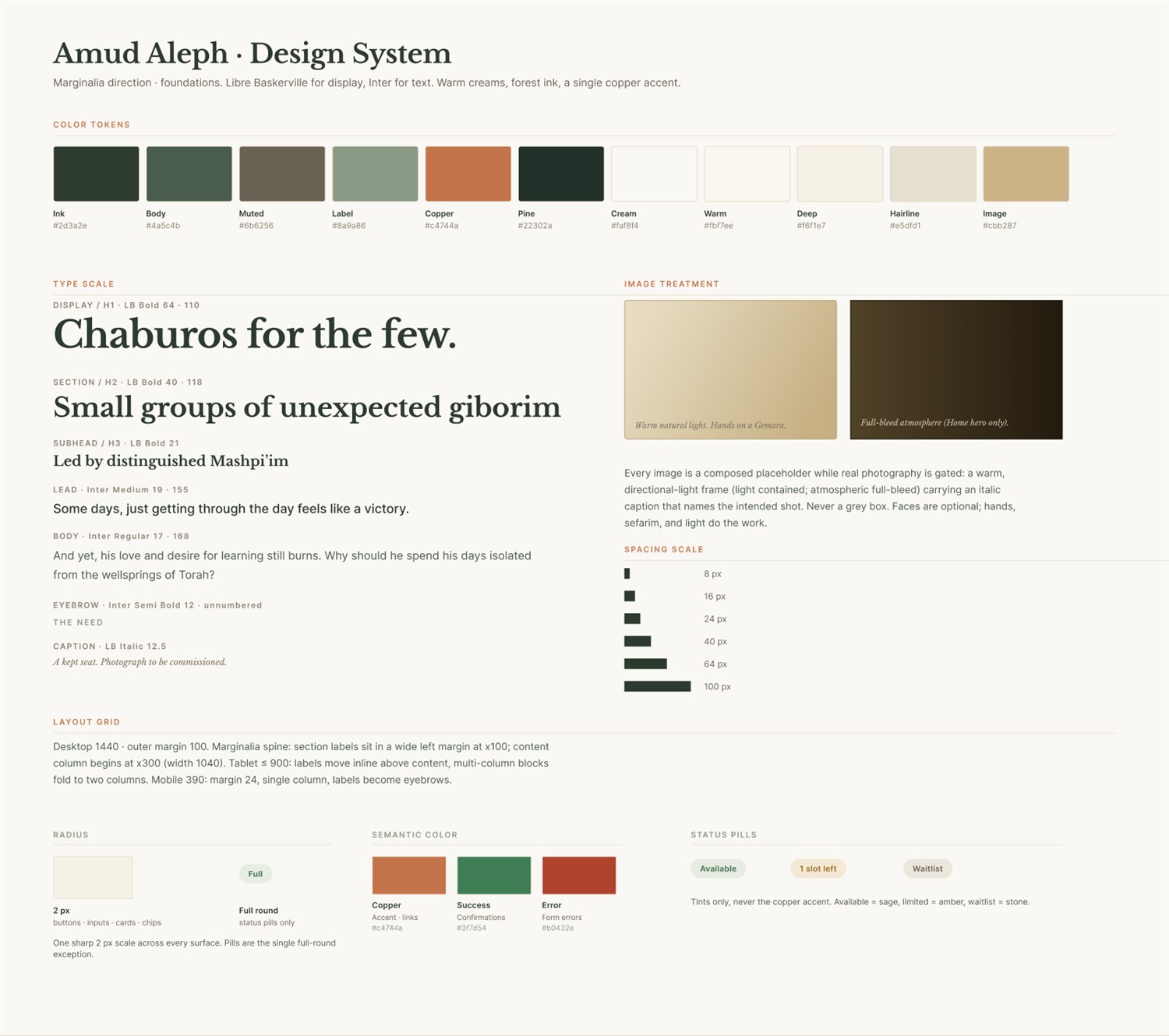
Design system
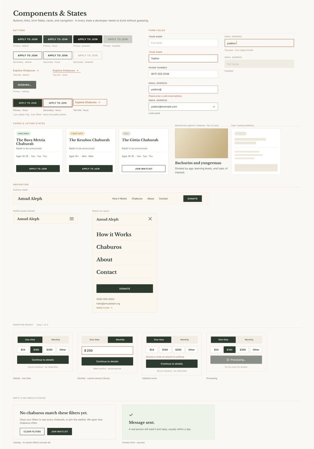
Foundations (tokens, type scale, image treatment, spacing, grid) and the component & state library: buttons, links, form fields, cards, and navigation (including the open mobile drawer) in every state a developer needs, now including loading states.
Completeness checklist
- All 6 pages designed at desktop width
- All 6 pages designed at mobile width
- All 6 pages designed at tablet width
- Nav + mobile nav (incl. open drawer)
- Footer, consistent site-wide
- CTA system (primary / secondary / text)
- Buttons: default / hover / pressed / disabled / loading
- Form fields: empty / filled / error / success
- Cards: available / 1-slot / full / editorial / skeleton
- Type, color, spacing, grid locked & applied
- Composed image placeholders, captioned
- Real June copy throughout, no lorem
- Real photography, all captioned shots + hero (gated)
- Real phone / email / address / Tax ID (gated)
- Chaburah rabbi names + live listings (gated)
- Board names / titles + photos (confirm with client)
- Victors portraits + real stories (gated)
- Interactive wiring, states shown but not wired (build phase)